Showing posts with label Theory. Show all posts

April 4, 2009

Tenerife [001] Shock and Awe


Where does a minimalist find joy in the jumble of tourist Tenerife? Suprisingly, gasps SpaceTM's Mark, absolutely everywhere

Tenerife has a reputation for the gaudy end of the travel experience. This is certainly justified. The cut-and-shut of architectural styles plastered with jumbled layers of signage turns tourist streets into a tumbling agony of colour and angles. Some areas would be a shock to the senses for even a hardened Brit-Abroad, so imagine the potential damage to the discerning eyes and nervous system of a staunch minimalist.


After the eye-rolling, gasping, tutting (and self-awareness that you are the only person wearing dark grey during the day) something life-affirming happens. Initially, everywhere is so wrong that it reinforces exactly how right you are. That anyone could do these things to a naturally stunning volcanic island makes you want to change the world that little bit harder. Indeed, instead of jumping on a jet to find the nearest John Pawson, the minimalist starts to do the exact opposite and seek out even gawdier areas to eye-roll, gasp and tut at. How right can this place prove me to be?


Then slowly (like eating chilli-peppers) each time you want to push the pain a bit further. The worse it gets the more you want and you feel the addiction start. Forget acres of white plaster and slate, look at that wall of badly printed towels!  The bad is so bad it twists and really becomes extremely good. You ache to get Martin Parr over to really do it justice.


And yes, you notice that intriguing sliver of modernist glass glinting on a distant hill; you adore that restrained surfers bar on the beach with simple decking, woven-grass seats and hand-painted box tables; you love the discreet restaurant with dark wood, white linen and modular cane furniture by Skyline... yes, here the diamonds in the dust are thrown into such sharp contrast that they become real shining gems. The good needs the bad to make it look even better. Then you can forgive the bad and it too becomes beautiful.


Then there is the real shock of a building so strong, awe inspiring and unexpected that it gives you one of the architectural experiences of your life...

I'm not sure whether Tenerife has a tourist board slogan but, if it hasn't, it should be this: Tenerife: Shock and Awe.


March 30, 2009

SpaceTM's Joe enjoys various silouettes

Self portrait

Victorian Railings

Window

March 16, 2009

The White Stuff: SpaceTM's Joe explores Maison Martin Margiela


I've always had a rather love/hate relationship with fashion. It started at university when I spent my entire student loan in one afternoon, only to realise white trousers and two-inch soled silver trainers were probably only a good idea if you can stay alive to wear them. And for that you also need to be able to purchase food at regular intervals. Oops.

These days I'm rather more pragmatic. I can coo at a fashion magazine, but I like being comfortable, so I'm happy to leave the flouncier feathers to the peacocks.

That said, I've always had a soft spot for Martin Margiela; the notoriously mysterious Belgium designer who started up his own fashion label – Maison Martin Margiela – in 1988, after working as an assistant to Jean-Paul Gaultier.

He has novel way of doing things. For example, he never gives interviews other than by fax and no one knows what he looks like.* He eschews celebrity and hides the identity of the models he uses with ponytail hairpieces, veils or – in catalogues – by placing black bars over their eyes (a pair of sunglasses from his 2008 spring/summer collection is shaped like such a bar and is named "Incognito"). His products don't come with a flashy logo, but a simple white rectangle, sewn on with four corner stitches (using white thread, natch) onto the inside of the garment.

*Ok, I'm sure his family know what he looks like, you get my drift.
 
As you may have already guessed, white is one of his favourite colours. "White means the strength of fragility and the fragility of the passage of time," the fashion house is quoted as saying in 2008. When it moves into new spaces – shops and the like – it takes over the furnishings of the previous inhabitants and paints them... you guessed it, white! And I don't mean a pretty, super-sleek, gallery kinda white, but a coarse, heavy handed "I had several bottles of WKD before I started this" white.

It also paints its garments. As as you might expect, over time the paint wears off. "Oh no! shhhhit! What am I gonna do?" Chill out, because this is all part of the Maison Margiela aesthetic. Whereas ageing and decay are generally considered taboo in the fashion industry, Margiela embraces the passing of time along with the associated wear and tear a garment may acquire. As the white paint gradually cracks, new textures and colours become visible. It's resurrection IN DRESS FORM.


I love white (see here for evidence of this) so you can perhaps understand why I dig all this sartorial monochromatic fetishism.

Incidentally, I did once try painting an old pair of trainers white. It actually led to me pulling someone in a bar (they were a Margiela fan), but I didn't account for the fact most footwear is designed to allow your foot to breathe in some way. If you pile on the emulsion, they soon start to stink...

 
Maison Martin Margiela 20. The Exhibition, is at Haus der Kunst, Munich, from March 20th till June 1st, http://www.hausderkunst.de/

March 14, 2009

SpaceTM's Mark muses on light


Above: Sunlight in Soho between 4pm and 4.30pm

The film industry spends millions on special effects that attempt to dazzle and amaze; fashion has become a huge, complex industry that exists to attract and stimulate the eye; and artists spend their lives – in the process sometimes destroying it – struggling to produce something which inspires both awe and thought. 

Yet none of the above, no architect, designer, advertising creative, painter or landscaper can stop me in my tracks, turn my day around and stun me into silence, nor inspire as much desire to live as the simple beauty of sunlight slowly moving across a room.

March 13, 2009

SpaceTM's Joe muses on cars

Above: Rain on a taxi window, London

I've always thought there was something romantic about staring through a rain-smudged window. It frames the view, turns it into a movie scene and conjures up all kinds of scenarios concerning travel, loss and the arrival of the unknown. 
 
When I was a child I would press my face against the window and enjoy sensation of cool glass against my warm skin (especially if the car heater had created an Amazon-like humidity). Then I would sit back and look at the outline of my features left on the glass. My dad hated that! 
  
I can't drive so I've never had my own car. That means I've never felt that sense of ownership others get from their automobile. Cars have an almost wombic association to me. They carry me around and protect me – and I'm not required to do all that much except just sit there, or maybe give the odd direction once in a while. You can't exactly press your face against the window if you're supposed to be driving. Well, not easily anyway...

February 1, 2009

Argument for modernist architecture


"Mr Janss, when you buy an automobile, you don't want it to have rose garlands about the windows, a lion on each fender and an angel sitting on the roof. Why don't you?"

"That would be silly," stated Mr Janss.

"Why would it be silly? Now I think it would be beautiful. Besides, Louis the Fourteenth had a carriage like that and what was good enough for Louis is good enough for us. We shouldn't go in for rash innovations and we shouldn't break with tradition."

"Now you know damn well you don't believe anything of the sort!"

"I know I don't. But that's what you believe, isn't it? Will you tell me why, when it comes to a building, you don't want it to look as if it had any sense or purpose, you want to choke it with trimmings, you want to sacrifice its purpose to its envelope – not knowing even why you want that kind of envelope? You want it to look like a hybrid species until you get a creature without guts, without heart or brain, a creature all pelt, tail, claws and features? Why? You must tell me, because I've never been able to understand it."

"Well," said Mf Janss, "I've never thought of it that way."


The Fountainhead, p163, by Ayn Rand, published by Penguin

January 22, 2009

Interview: Tenzing Rigdol

The way colour is used in our environment can have a lasting impact on our lives, as Tibetan artist Tenzing Rigdol explains.

“My childhood reminds me of my mother’s favorite colour – purple! She would have me and my younger brother all covered in purple clothes. Even the sweaters, gloves and mufflers that she arduously wove were all in purple. So the colour purple has become the colour of my childhood and I used it as the base for this painting [Mandala Of Kids, 2008, see below]. It is cold clean and innocent. I think that we all have similar traces of it.”
  

Mandala of Kids, 2008, Acrylic on canvas 136 x 134 cm (53_ x 52_ in) © Tenzing Rigdol

Five facts about Tenzing Rigdol
1. He was born in 1982 in Nepal.
2. In 2002 he and his parents were granted political asylum in the USA.
3. He is experienced in the traditional Tibetan arts of sand painting and butter sculpture.
4. He studied art and art history at the Univsersity of Colorado, USA.
5. Talking about his sculpture This Is Not A Chair he explained: “I wondered if I could change the functionality of a clearly defined object by adding other values to it. In this case, I covered the chair with Tibetan Buddhist scriptures and asked myself if this could still be a chair? Perhaps it is a chair which one cannot use to sit on, or maybe someone can sit on it while others cannot, depending on their own mental disposition.”

The Exhibition "Experiment with Forms: Tenzing Rigdol" is at Rossi & Rossi Ltd, London, from Feb 11th to March 27th 2009.

December 30, 2008

Metropolis

Could this be the future of town planning? 

Is high rise living still a viable option? Discuss...

December 22, 2008

The Ikea Polemic by SpaceTM's Joe


So everyone's got a bit of Ikea in their house... Haven't they? (Well, unless you think furniture ain't furniture without a baroque flourish). So why is it still a dirty word?
  
Maybe it's because everyone's shopped there. Or maybe it's because there are only so many times coming home with nothing but tea lights seems like a good idea. 

Bauhaus chief Walter Gropius championed a style in architecture and consumer goods that were functional, cheap and easily mass produced. Or to quote the Bauhaus Wikipedia entry (er, thanks to whoever wrote this): "Gropius wanted to reunite art and craft to arrive at high-end functional products with artistic pretensions."

Perhaps Ikea its the perfect realisation of the Bauhaus ideal?

(In other words surely this is better than this...?) 

December 13, 2008

Colour Theory: RED [001]

red shop sign
  
red leaves and fruit (and red van)
 
red warning
 
All pictures copyright Joe Heaney, 2008

Colour Theory: RED [003]

red sign (Callais, France)

Other Important examples of RED:
RED stop traffic light
RED nose after a cold
RED light district
RED and white barber's shop sign
RED wine
RED cape used by a bull fighter
All pictures copyright Joe Heaney, 2008

Colour Theory: RED [002]


red fabric
 
red light (NB singer VV Brown in concert, not a Francis Bacon painting)
 
red cord (courtesy of the cafe)

All pictures copyright Joe Heaney, 2008

December 10, 2008

SpaceTM's Joe walks on water [001]


Traveling from Dover to Callas on a P&O Ferry; a strange world where the stairs come in colours and a fry up meal in the cheap restaurant costs over £7.

I decided not to try the posh restaurant.


All pictures copyright Joe Heaney, 2008

December 9, 2008

Interview: Jean Charles de Castelbajac


Designer Jean Charles de Castelbajac talks exclusively to SpaceTM about the creative process and where his ideas come from.

From JCdC
"For me, creation is part of a precise process:
 
1. The Accident: when two images meet in my head for a second, creating a smash. [This suggests] an idea. After that the idea is [stored] in a special department in my head named "supra-reserve", ready to be used at any moment.
2. The Syncronicity: when I start to design, imperfections or mistakes [suggest] another way to see... then i just follow the road.
3. The Pollination: when I bring one universe unto an other – fashion to music, music to design – something super exciting starts to appear [and] I become a king bee pollinizing new flowers of creativity.
4. The Bauhaus Rules: I used to believe that every good design submits to its function! But today I often transgress that rule.
5. The no-limits of hijacking: every image belongs to me! I invented co-branding in fashion 40 years ago when I signed my jeans "Jesus". Today the world belongs to pirates of [all] kinds." Jc De Castelbajac

Four Facts About Jean Charles de Castelbajac
1. He was born on November 28th 1949 in Casablanca, Morocco.
2. He's the Marquis de Castelbajac, which makes him a French nobleman.
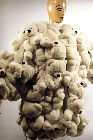
3. One of his most famous fashion creations is a coat of teddy bears worn by Madonna and supermodel Helena Christensen in the film Pret-á-Porter. He's also made liturgical robes for Pope John Paul II.
4. As well as fashion he also designs home furnishings.

December 6, 2008

The Con of Concepts


Do concept cars drive you wild? Asks SpaceTM's Mark...

The blend of bleeding-edge design and technology in concept cars has always pumped me full of excitement and optimism. For decades they have given me dilated pupils – from the Pantone pen, speed-streaked, airbrush-glossed illustrations in my teens to the photo-realistic CGI monsters of today.

Millions are spent by automotive designers, technologists and engineers to show-off and create these glimpses of the future, but it's a future that never seems to arrive. Where are they?

Now, even as a designer, I am not so unrealistic as to think that every family with children could use this Pininfarina Concept. But look at the roads. Nothing even approaches those old illustrations from my teens. Even this Pininfarina Concept is five years old. Surely, after decades of promise, the percentage of cars that give us even a hint of these optimistic creations should be higher. One Lamborghini per millions of boxes on wheels is not enough.


Concept cars drive me wild. But now they are starting to drive me wild with disappointment. I am realising that they are just automotive porn and feel foolish that I was so optimistic as to believe the future could be so full of excitement and so full of beauty.

But my disappointment with the makers of these concepts is the strongest. If they are so passionate as to be involved in creating these deceptions, why let them only be deceptions? If they can't actually realise their dreams then ours will never be realised either.


Pininfarina 75th Birdcage Concept, 2005

November 15, 2008

November 13, 2008

Playing around

Ever needed an excuse to mess around? How about if we told you it actually makes you a better designer. (Go tell that to your boss!)
  
Here Tim Brown, the CEO of design firm Ideo, explains why "play" is so important to creativity. 


October 17, 2008

Food For Thought

 
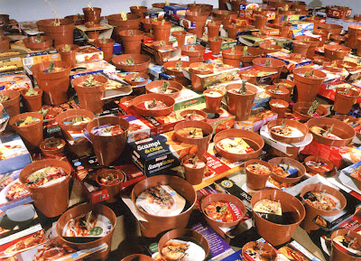
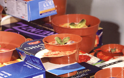
If you want a fascinating insight into how design is used to make us buy stuff, then check out the work of artist Caroline McCarthy says SpaceTM's Joe.


I've been reading art critic Chris Townsend's book New Art From London which includes this passage describing (and exploring) McCarthy's work:

"The packaging of ready meals is almost utterly generic, as a quick visit to any supermarket, or perhaps a look inside your fridge will confirm. The back of the thin card sleeve will carry cooking instructions; the front will bear an idealized photograph of the cooked meal and, since such ready meals are almost universally 'classics' of distinctive national or regional cookery, there will be some kind of visual symbol of generalized ethnicity or location alongside it. A spaghetti dish might have somewhere an image of the leaning Tower of Pisa; a curry, the Taj Mahal; a boeuf bourguignon, the Eiffel Tower.

Despite the fact that we rarely notice such packaging... Despite the fact that they are so utterly disposable, despite our fleeting encounter with them, these cartons are 'designed'.

Each of those generic photographs will be elaborated in some way, making the meal into an exaggerated promise of experience – even if we know it's just a ready meal, something utterly prosaic. There may be gleaming cutlery, a glass of wine; certainly the meal itself will be garnished with a clearly visible herb, perhaps a sprig of parsley or basil leaves.

It is this tiny, irrelevant sign that is the hyperbolizing mark; it removes the meal from your kitchen, your microwave, and transports it into a restaurant that is, by association with the tropes of ethnicity and the exotic spaces of tourism the pack also bears, somewhere other than here. (After all, when did you last garnish a meal? Ready meal packs certainly don't contain them.) McCarthy takes this barely visible figure of nature and glamour, cuts round it, and lifts it so that the pack becomes a surface from which it springs [as in her work Promise, 2003, pictured].


These food products are about as distant from 'nature' and the 'exotic' as you can get; assembled from a multitude of ingredients in a sterile factory in Lincolnshire or West London by cut-price labour and machinery in a matter of seconds.

McCarthy wants us to understand how one sign works upon us, and how changes to that sign may change not just 'meaning' but our perception. In doing this she not only begins a critique of the process of design – the designation of the sign – she returns, by a rather unexpected route, to that subject for art which so concerned artists of the post-minimalist generation – the phenomenological relation of subject and object."

Adapted from Chris Townsend's book New Art From London , pages 110-115, published by Thames and Hudson. Go read it, it's great.