
If you want a fascinating insight into how design is used to make us buy stuff, then check out the work of artist Caroline McCarthy says SpaceTM's Joe.
I've been reading art critic Chris Townsend's book New Art From London which includes this passage describing (and exploring) McCarthy's work:
"The packaging of ready meals is almost utterly generic, as a quick visit to any supermarket, or perhaps a look inside your fridge will confirm. The back of the thin card sleeve will carry cooking instructions; the front will bear an idealized photograph of the cooked meal and, since such ready meals are almost universally 'classics' of distinctive national or regional cookery, there will be some kind of visual symbol of generalized ethnicity or location alongside it. A spaghetti dish might have somewhere an image of the leaning Tower of Pisa; a curry, the Taj Mahal; a boeuf bourguignon, the Eiffel Tower.
Despite the fact that we rarely notice such packaging... Despite the fact that they are so utterly disposable, despite our fleeting encounter with them, these cartons are 'designed'.
Each of those generic photographs will be elaborated in some way, making the meal into an exaggerated promise of experience – even if we know it's just a ready meal, something utterly prosaic. There may be gleaming cutlery, a glass of wine; certainly the meal itself will be garnished with a clearly visible herb, perhaps a sprig of parsley or basil leaves.
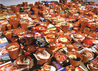
It is this tiny, irrelevant sign that is the hyperbolizing mark; it removes the meal from your kitchen, your microwave, and transports it into a restaurant that is, by association with the tropes of ethnicity and the exotic spaces of tourism the pack also bears, somewhere other than here. (After all, when did you last garnish a meal? Ready meal packs certainly don't contain them.) McCarthy takes this barely visible figure of nature and glamour, cuts round it, and lifts it so that the pack becomes a surface from which it springs [as in her work Promise, 2003, pictured].
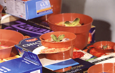
These food products are about as distant from 'nature' and the 'exotic' as you can get; assembled from a multitude of ingredients in a sterile factory in Lincolnshire or West London by cut-price labour and machinery in a matter of seconds.
McCarthy wants us to understand how one sign works upon us, and how changes to that sign may change not just 'meaning' but our perception. In doing this she not only begins a critique of the process of design – the designation of the sign – she returns, by a rather unexpected route, to that subject for art which so concerned artists of the post-minimalist generation – the phenomenological relation of subject and object."
Adapted from Chris Townsend's book New Art From London , pages 110-115, published by Thames and Hudson. Go read it, it's great.
![[Ibiza Gran Hotel: The Chairs]](https://blogger.googleusercontent.com/img/b/R29vZ2xl/AVvXsEiEc4bhN8Bs8_dtcsE85oSvgEF-DDCCjEP96dzMGxY4faRXWxT8G4AgN66OS6O8T87mPHn7hmA4ZaVOhW9NcyZ-EJwB7bPC_E8wGzPGz8sCfYf9OHu8PNANQ2QSOCfVd6na_KD_1B2cRgUy/s288/MENU%20IGH%20Foyer.jpg)
![[Interview: SpaceTM's Joe Meets Graham Rawle]](https://blogger.googleusercontent.com/img/b/R29vZ2xl/AVvXsEgouMcjhIwP8GznjedkYNd4kNWxunUxE1H12hNK97AdSJsTTt0e2FwYq1nxcdUfmVudvOnFIsWn3RWN_lI2JeDVa9qMqsCet5B1MeVcqVDIvKkxCRRhyphenhyphendfPJSxsVUC4A4vWkQwgdSKEEHda/s288/MENU%20graham%20rawle.jpg)
![[Old Signs]](https://blogger.googleusercontent.com/img/b/R29vZ2xl/AVvXsEgjRz0_wKaup-wxnSS6C1ktj8qo2uZQynsuVTp4dtXNCJO7mMNsGegNKWyrep6WIBGChykDcU7k0Ik5KHXCti9Nkz0vVaZWqtXBEXgoh4rVvNtgfLMoAifaTgf60cu4vse1NNftWzgk1X8S/s288/MENU%20No%20sign.JPG)
![[The Con of Concepts]](https://blogger.googleusercontent.com/img/b/R29vZ2xl/AVvXsEieLzrh-nC3GTFjkw-62cRDm4qPgacGbskOlgCDBVo_ZimKAitX_hQA1GQFXjh3jCuPZHicy2J0isOgTWAPCFvpBBTOtVRd8x3_m0jM6O6M1ZZ_a-1GtiG91EKsQVU5SgrotECRUUca9th6/s288/MENU%20Pininfarina%202.jpg)
No comments:
Post a Comment